Pine is Kajabi’s design system. It’s a library of web components that don’t care which framework a page is built in, sitting on top of design tokens and an icon library, with docs written for people and AI tools.
It’s run by a small core team, and honestly, that shaped most of the decisions behind it. When there aren’t many of you, you can’t review your way to consistency, so the system has to enforce it. I’ve been one of its core maintainers since 2023.
- Role
- Sr. UX Developer, core maintainer
- Company
- Kajabi · 2020 to present
- On Pine
- 2023 to present
- Focus
- Components, tokens, icons and AI tooling
- 36 components
- 4 connected repos
- 40+ engineers supported
- 4 major versions
The problem
Products rarely stay on one framework, and Kajabi’s doesn’t. A component library tied to one framework means building every component again for each of the others, then keeping the copies in sync. They never stay in sync. Buttons end up close-but-not-quite, and so does the rest of the UI.
One implementation, multiple frameworks
Pine is built from web components, custom HTML elements the browser understands on its own. The same component works in any framework, and Pine’s React wrappers are generated from it rather than written by hand. Here’s the same button in a Rails view and a React app:
Rails view
<pds-button>Save</pds-button>React app
<PdsButton>Save</PdsButton>A fix ships once and lands everywhere the component is used. Underneath it all are design tokens, the named values for color, spacing and type. Tokens are defined in Figma and flow one way into code, so a token change reaches every component without anyone copying values across by hand.
What the system is built on
Pine is built in layers, and each one has a single job. Layout arranges the page. Components handle what happens inside it. Tokens style both. Patterns come from combining those small pieces, not from building one-offs.
Layout for composition
Box and row primitives arrange everything on the page. Their spacing only accepts values from the scale, so patterns compose cleanly and off-scale gaps can’t be written at all.
Primitive components
Buttons, inputs, tables, alerts and the rest handle interaction, state and accessibility. They drop into any layout, so building a pattern is mostly a matter of combining them.
Tokens for style
Color, spacing and type come from tokens in three tiers: core, semantic and component. Themes like dark mode swap the semantic values, and hard-coded colors are flagged before merge.
Readable by AI tools
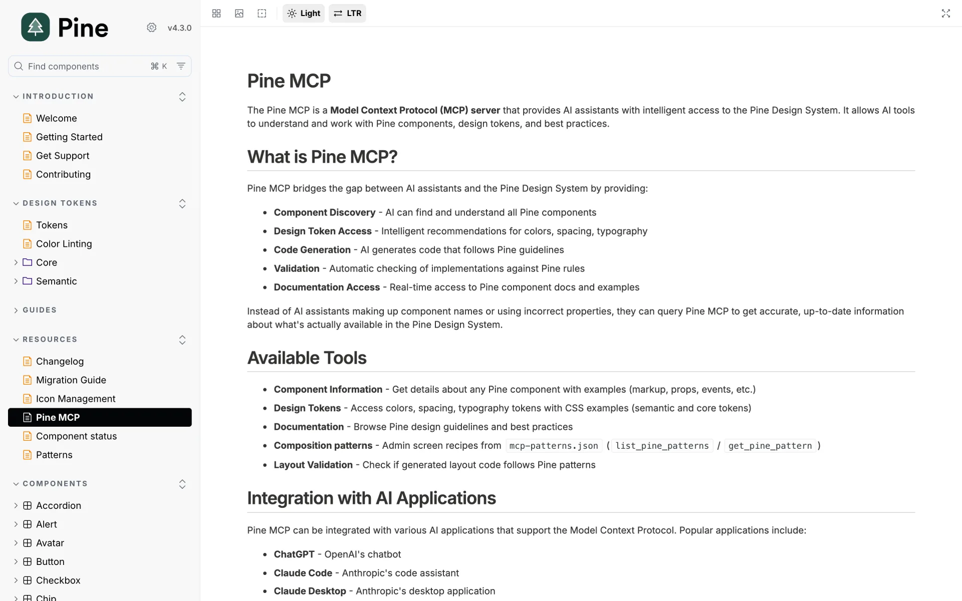
Agent instructions and an MCP server, a standard way for AI tools to call outside services, let coding tools look up real components and check their output, instead of inventing them.
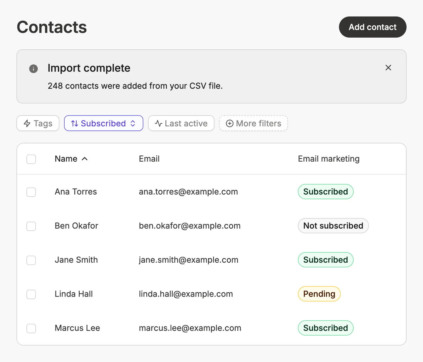
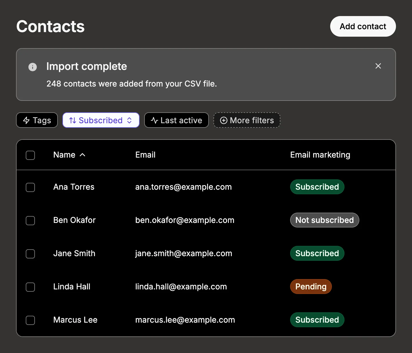
Documentation people actually use
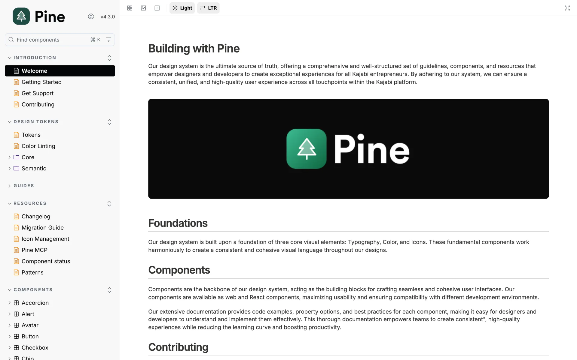
A component nobody can figure out doesn’t get used. Pine’s docs site covers every component with usage guidelines, live examples and property tables generated from the source, so the reference can’t drift from the code.
Around the components sit guides for the things teams get stuck on, like forms, accessibility, events, motion and right-to-left layouts, plus getting-started and contributing docs, a changelog and migration guides between major versions. The same content feeds the MCP server, so people and AI tools read from one source.
My contributions
I’ve been a core maintainer since 2023, and I’ve worked in every layer of the system. I’m also one of the first people engineers and designers come to when they’re building with it. Pine is a team effort, and most of what’s here was shaped together. These are the areas where I’ve had the biggest hand.
Developer support
Answering questions, unblocking teams, reviewing their code and turning the questions that keep coming up into better docs.
Documentation
Writing and maintaining the docs: component guidelines, live examples and the guides teams lean on most. Then keeping all of it current.
Components
Building and maintaining components, simple form controls and big data-heavy ones alike, through each major version.
Foundations
Working on the layout, tokens and icons that every component sits on, and keeping them consistent as the system kept growing.
AI tooling
Starting the Pine MCP server and the first AI agent instructions, and growing both as AI tools became part of daily work.
Accessibility
Fixing accessibility issues across the system, like form errors screen readers never announced and low contrast in the dark theme.
Outcomes
Built once
Every component is built once and works in any framework, with React wrappers generated instead of hand-written.
Small team, real coverage
Four major versions and over a thousand automated tests since 2024, kept up by a small team with automated checks.
Growing adoption
Pine use across Kajabi keeps growing, with more of the product’s UI built from its components every year.
What I learned
Automate the rules you care about
With a small team, anything enforced only in review slips through. Checks turn conventions into failing builds, and anything with a source of truth, like the token docs, should be generated rather than written twice.
Slots for content, props for config
Letting people pass their own markup into a component, instead of strings, made components far easier to compose. Settings stay as props. Adopting the rule later meant a breaking change, so it’s worth deciding early.
AI tools are a real audience
Coding agents have a limited reading budget, stumble on near-miss names and never notice missing data. Designing for them meant short answers, forgiving lookups and failing loudly, which made the docs better for people too.
A ratchet only helps if someone turns it
Pine’s accessibility check blocks new problems, while existing ones were recorded in a baseline so the check could switch on at all. Paying that baseline down, one fix at a time, is the part that takes discipline.